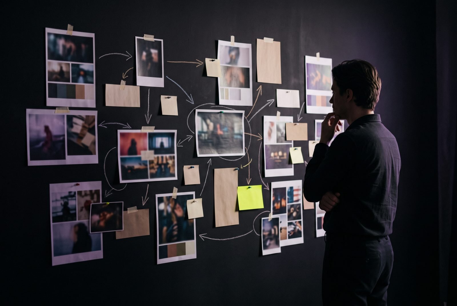
The website looked great. Nobody knew what to do.

VIQ Studio
4-minute read
A practical VIQ Studio observation. No performance claim is implied.
Imagine entering a beautiful shop. The lighting is perfect. The displays are carefully arranged. But there is no price, no explanation of what makes the product different and nobody to ask what happens next.
Some websites behave exactly like that.
The overlooked problem
A digital experience can create an excellent impression and still leave a visitor uncertain. The cost of that uncertainty may be a missed enquiry, an abandoned product page or simply someone deciding to look elsewhere.
Three useful questions
First: can a new visitor explain the offer without searching through the whole site?
Second: is there a credible reason to trust it, such as clear information, useful examples or a transparent process?
Third: can the visitor see the next step, and does it feel proportionate to the decision they are making?
Design for the decision
Keep the visual ambition. Remove the unnecessary effort. Show people the important answers at the moment they need them.
A website does not need to become plain to become understandable. It needs to become intentional.
Keep reading

A better logo will not fix a confusing offer.